Made in the Shade: sunglasses exhibit Inspiration, and logos
09.11.2009 § Leave a comment
for our next big project in type II we are designing a logo and poster for an exhibit at a fake museum of collections.we will be including a personal collection in the exhibit poster and im going to do sunglasses. i only really need one pair but if i find some for cheap i always pick them up. thrift stores are where the bulk of them come from because i refuse to pay more than $5 cause i loose them as easily as i buy them. they are also a great piece to accent any outfit!
here are some ballin logos


![]()
Cadek Conservatory of Music
09.09.2009 § Leave a comment
our very first project of this semester for type II we were given the task of designing an academic calendar for cadek conservatory, once that was complete, we then took the calendar and expanded it to a poster. im not a big fan of black and white information design, so the second phase was a bit more up my alley! i was really influenced by cristiana couceiro and fell in love with the idea of mixing image with flat color and simple design, not to mention im a sucker for vintage images. it’s always interesting to see how far i come in each project. mostly when im heavily inspired by a piece i try to recreate it but normally end up trying to hard , going in a completely new direction and finally come up with a solution. below is the fist try followed by my final piece…
The Beginning

The Final

inspiration station
09.03.2009 § Leave a comment
two words: criterion collection. if you are a design nerd and dont know about the criterion collection then go here http://www.criterion.com/ as soon as possible… aka now! they have the best selection of classic, indie, cult, foreign films, documentaries, and everything in between. the box design is to die for. even if the movie is lame i would buy it just for the packaging. my boyfriend and i have the dream to own them all one day but for now i will be happy with our very very modest collection.
our CC babies


a much better blog collection of the best covers done by criterion
http://wellmedicated.com/inspiration/an-ode-to-criterion-box-art/


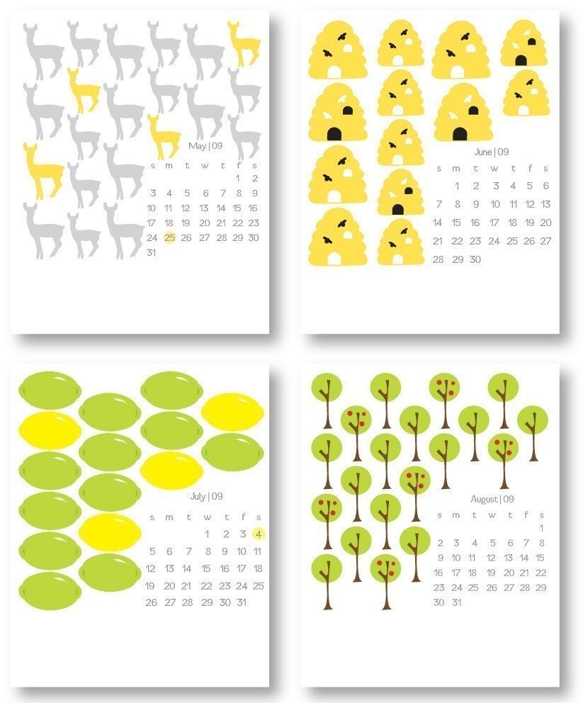
charts & calendars
08.19.2009 § 1 Comment
Im a bit confused by the article we had to read-Robin Kinross’ The Rhetoric of Neutrality. but from my research i think that there is a way to make information design interesting and inventive, as a designer i think its our job to make it unique and visually delicious. though bonsiepe wavers back and forth on whether plain information type has rhetoric or if it is exempt, i think that there is a definite voice behind all text… in some cases it just happens to be boring and monotone 🙂 heres to hoping mine is not
some lovely examples of information design that make me happy


http://www.flickr.com/photos/kimasendorf/3803825294/
http://www.behance.net/Gallery/Dorogaya-Magnetic-Calendar/97189